Thursday, March 13, 2008

Week 3: Professional design collection

Choose an insurance company or bank and try to find a variation in the way they present their logo.


Find a number of slogans for insurance and banks in Australia:


Commonwealth bank
“Which bank?”
"Make it happen"

Westpac
“Australia’s first bank”

ANZ
"Australia's most convenient bank"
"That's ANZ NOW"

NAB
"a little word for a big life"

HSBC (Hongkong Bank of Australia Limited)
"The worlds local bank"

Citibank
"Let's get it done"

St George
“Good with people. Good with money.”

AAMI
“Lucky you’re with AAMI”

GIO
“we don’t just listen we do”

NRMA
“We can’t help but help”

Allianz
“Insurance solutions from A-Z”

CGU
“We put the you in CGU”

HCF
"We're different from other funds"

MBF
“Take a positive step”

Week 2: Professional design collection

Find three logos that use variations of primary shapes - circles, square, and triangle:


Week 2: Reading Reflection

What seems to be the difference between logo design/corporate identity/branding?

Logo design is an important area of graphic design. The logo is the image embodying an organization. A logo is a graphical element, (symbol, emblem, icon, sign) that, together with its logotype (a uniquely set and arranged typeface) form a trademark or commercial brand. Typically, a logo's design is for immediate recognition, inspiring trust, admiration, loyalty and an implied superiority.

Corporate identity is concerned with the visual aspect of a company's presence. When companies undertake corporate identity exercises and development they are usually modernising the appearance of logo and design. This task does not usually entail a change in brand values, what it stands for or its personality.

Brand identity is the total proposition that a company makes to consumers - the promise it makes. It may consist of features and attributes, benefits, performance, quality, service support, and the values that the brand possesses. The brand can be viewed as a product, a personality, a set of values, and a position it occupies in people's minds. Brand identity is everything the company wants the brand to be seen as. Brand image however, is the totality of consumer perceptions about the brand, or how they see it, which may not coincide with the brand identity.

Sunday, March 2, 2008

EXERCISE 2 - Circle Logo

First lot of experiments with 'circle' logo:


Friday, February 22, 2008

EXERCISE 1 - Logo Analysis

LOGO 1 : Adobe Creative Suite 3


Adobe has been known to change branding strategies every new version, particularly the logo and icon aspects. Take Photoshop for example. From versions 1.0 to 7.0 there was the ever-present eye in each of the whimsically conjured designs. But this was followed by a more nature-friendly feather concept starting with the two generations belong to the Creative Suite

For CS3, though, Photoshop and practically every other member of Adobe’s Product line has adopted a drastically different icon scheme sporting two letters of the product name on a soft-gradient-fill-ed square.

As Adobe's products have grown deeper and broader in their capabilities, the effort to visually represent what they can do in a literal icon has become increasingly difficult. This challenge became particularly evident when the legacy of eyeballs on beaches and Venus De Milo was replaced with nature imagery in the current Suite era. (CS1/CS2 feathers and butterflies)


LOGO 2 : Nintendo


Aesthetically I think its pleasing. Its fairly simple, clean, and unintrusive when featured on materials. The emotional attachment I feel towards the company is something of a warm satisfaction. It bleeds quality. Fellow gamers know that when you pick up a box with this logo featured (normally only featured if they developed or published the game) that this product means at least a satisfactory - excellent calibur.

Nintendo didn't get to be who they are today by selling poor quality games. Even if I haven't played the game I know in confidence that the vast majority of titles that fall under their banner are superior to similar titles of the genre by other developers.

Its also a logo that some may consider as being timeless. That original featured logo remains unchanged after 23 years in the videogame business.

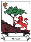
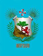
EXERCISE 1 - Mifsud Family Crest


My parents could not tell me much about our family crest or history, etc. Personally i feel no real attachment to my family crest as my parents migrated to Australia over 30 years ago.

The palm at the top is the 'Gummar', a Maltese Native plant. The Palm leaves at the bottom are of The Date Palm, which has been cultivated in Malta since Phoenician times. The tree is a symbol of antiquity and strength.

The Maltese cross was adapted by the Knights of the order of St John, while in Malta. A star depicted on a coat of arms symbolizes honor, achievement and hope. Stars with wavy points are emblems of God's goodness, or some other eminence that elevated the first bearer above the common people.

The lion has always held a high place in heraldry as the emblem of courage, and, hence, that of a valiant warrior. The lion, with such repute of its noble nature and having the position and title of king of the beasts, is naturally one of the most common heraldic symbols on the continent of Europe.

However... i do like cats... and the lion is a big cat after all. (thats about the only personal attachment i can form with my family crest)